
007 Museum App
The visit guided by your favourite James Bond agent
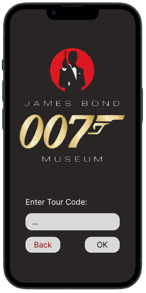
App prototype
The brief was to redesign the museum website. I proposed going further, adding a mobile app that turned the visit itself into an interactive experience. Rather than a simple online store, the app gave visitors an AI-narrated audio tour, exhibit exploration, and a deeper connection to the Bond universe on-site. This became the centrepiece of our submission.
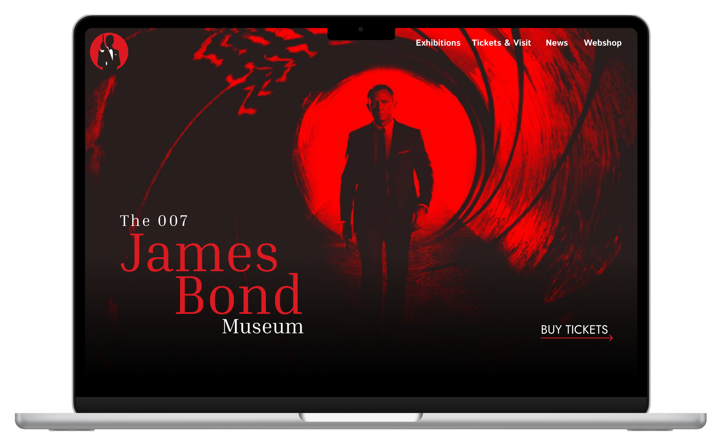
Museum website (existing)
The existing site had grown organically from a personal collector's blog into a full museum, but the webpage never caught up. Infinite scroll, no navigation logic, no visual consistency, no information hierarchy. It was chaotic. A team member took on the total transformation: bringing structure, clear navigation and coherence to something that had none. I contributed to the concept and UX decisions; the visual redesign execution was theirs.
Play James Bond Theme Song
Project Overview
James Bond is one of the most enduring franchises in cinematic history, spanning over 60 years, 25 films, and generations of audiences worldwide. In Gothenburg, Sweden, there is one place in the entire world dedicated entirely to this legacy: the 007 James Bond Museum.
For the course Visualizationat OsloMet, our team of 3 was tasked with redesigning the museum's website. Given only one month to research, design and deliver a high-fidelity prototype, I proposed going further than a website redesign: a mobile app that would transform the visit itself into a multisensory, story-driven experience narrated by iconic Bond voices generated with AI.
The goal was to give the only James Bond museum in the world a digital presence worthy of the franchise it represents.
Final Prototype:
Figma Finished Prototype APPContext
Since 1962, James Bond has been a cultural phenomenon: a symbol of elegance, adventure and cinematic craft that has shaped popular culture across generations. With 25 official films, countless international audiences, and a legacy that spans more than six decades, the franchise remains one of the most recognisable in the history of cinema.
In Gothenburg, Sweden, one man built the only museum in the world entirely dedicated to this legacy. What began as a personal collection grew into a physical space full of rare memorabilia, original props, cars, gadgets, and film artefacts. Unique in the world, and yet almost invisible online.
The museum's website had never caught up with what the collection had become. Poor navigation, no information hierarchy, and no sense of the brand experience it was meant to represent meant that casual visitors were lost before they ever bought a ticket. And without a digital presence that could speak to younger audiences, families, or international tourists, the museum's reach was limited to those who already knew it existed.
Our brief: redesign the digital experience. Our timeline: under one month.
Challenge
Expand the museum's audience to younger demographics and casual visitors, without alienating the loyal fan base. What could a well-designed digital touchpoint add to the experience that would make someone who's never heard of the Gothenburg museum actually want to go?
The museum's digital presence only spoke to die-hard fans. Younger visitors, families, and casual movie enthusiasts had no reason to engage.
Ticket purchase and merchandise were buried. Once a visitor clicked deep into content, there was no way back, the site had no persistent navigation and no clear conversion path.
A growing collection of Bond history, cars, gadgets, cinema, memorabilia, trapped inside a guided tour with limited languages and no digital companion. The museum had everything to become a cultural attraction. It just had no way to show it.
My Role & Contributions
This was a team project, but my focus was on the interactive, user-centered, and accessibility-driven aspects of the app prototype.
Innovation & Design Thinking
Proposed the multisensory app concept: audio tours narrated by AI-generated James Bond voices as the core differentiator. Growing up watching the films with my parents made the idea feel personal and concrete.
Prototyping & Interaction Strategy
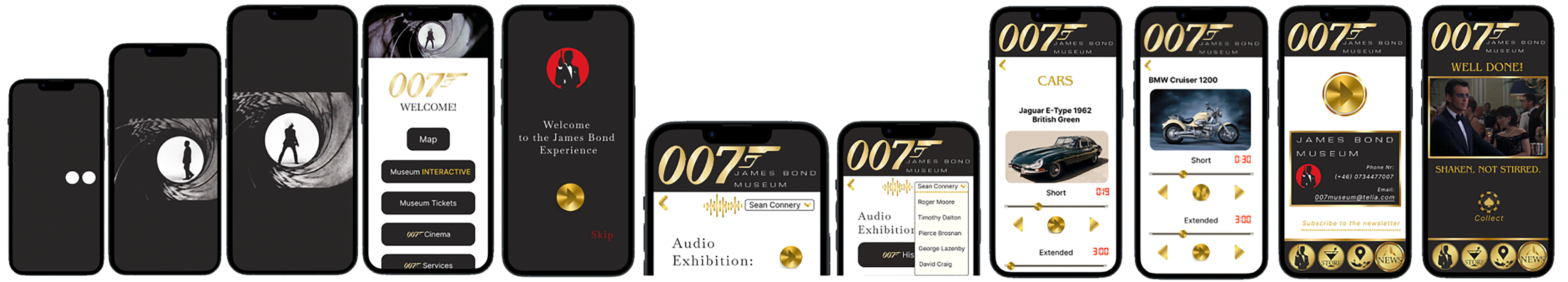
Mapped the two main user journeys ('with ticket' and 'without ticket'), designed navigation flows, and built the interactive Figma prototype through two full iterations.
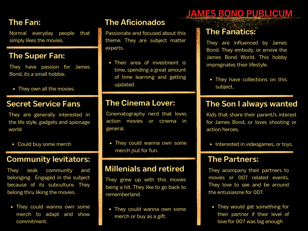
UX Research & Data Overview
Analysed the museum's existing website, mapped all content categories, and built an audience segmentation of 10 visitor profiles (fans, families, cinema lovers, partners and more) to ground our design decisions in real user motivations.
User Testing & Feedback Analysis
Designed a 14-question scripted test protocol. Personally conducted 2 of the 6 usability tests (10 total participants, ages 20–60) and synthesised findings across the team to drive iteration.
Media Generating & Editing
Produced the loading animation (a compilation of Bond's iconic on-screen entrances), and sourced AI-generated Sean Connery audio via 101Soundboards for the prototype's audio tour.
Research
Grounded in Don Norman's human-centred design principle to “find the right problem while considering all people,” our research covered three areas: the James Bond fan base, the brand and character identity, and the museum's existing website content.
Audience Segmentation
We mapped 10 distinct visitor profiles, because the James Bond audience is never just one type of person, and rarely arrives alone. A grandparent who grew up with Sean Connery might visit alongside a grandchild fascinated by gadgets. A die-hard fanatic might bring a partner who has never seen a single film. A group of millennials revisiting nostalgia shares the same space as a child with a short attention span and no patience for long texts. Each profile had different motivations, different friction points, and different accessibility needs. Designing only for the most obvious user would have meant failing everyone else in the room.
James Bond Publicum, fan personas
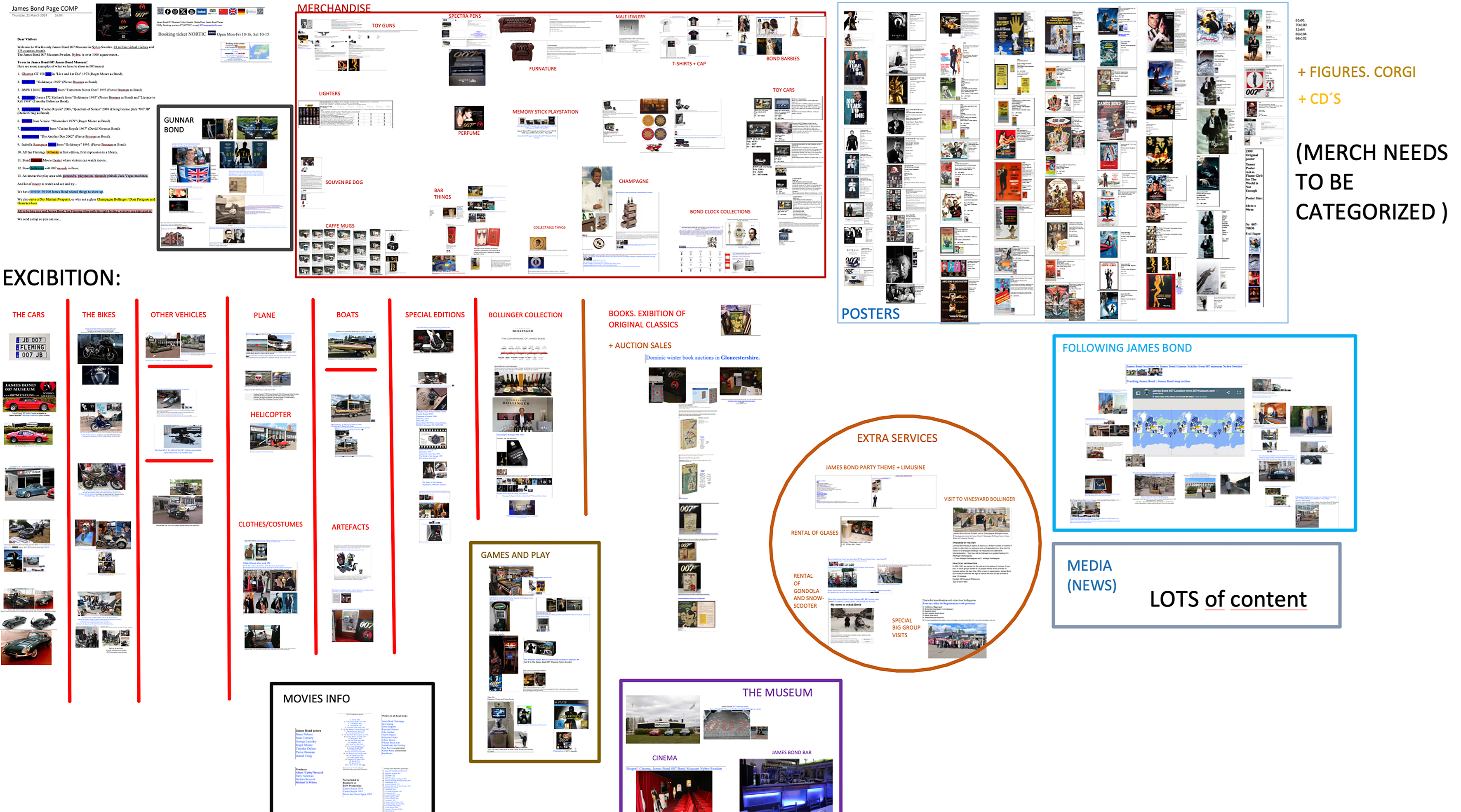
Content Categorization
The existing site had an overwhelming amount of content with no clear hierarchy, cars, gadgets, costumes, posters, auction items, news, and cinema all competing on the same level. Merchandise wasn't categorised. We mapped every content category to understand what to keep, cut, and reorganise before touching any design.
Content categories mapped from existing website
Design Principles
Five principles guided every screen, ensuring the app was on-brand, genuinely usable across a wide age range, and accessible to users with different needs.
Progressive Disclosure
Content revealed step by step. Users choose how deep to go, no overload on arrival.
Hick's Law
Limited visible choices per screen. Gold label guided users toward 'Immersive' over 'Limited' without forcing.
Consistency & Branding
Bond's visual language, gold, black, elegant typography, maintained across every screen.
Error Prevention & User Control
Explicit back button added after testing revealed navigation confusion, especially for users over 50.
Multisensory Experience
Audio tour in iconic Bond voices extends the brand beyond visual and benefits users with reading difficulties.
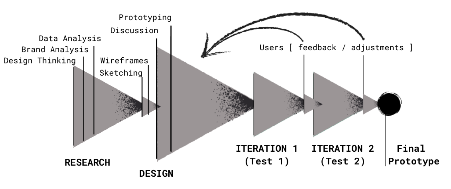
Design Process
Our process was iterative and agile, research fed into sketches, sketches into prototypes, and two rounds of user testing shaped the final design. Keeping communication tight meant the whole team could move forward together despite the tight deadline.
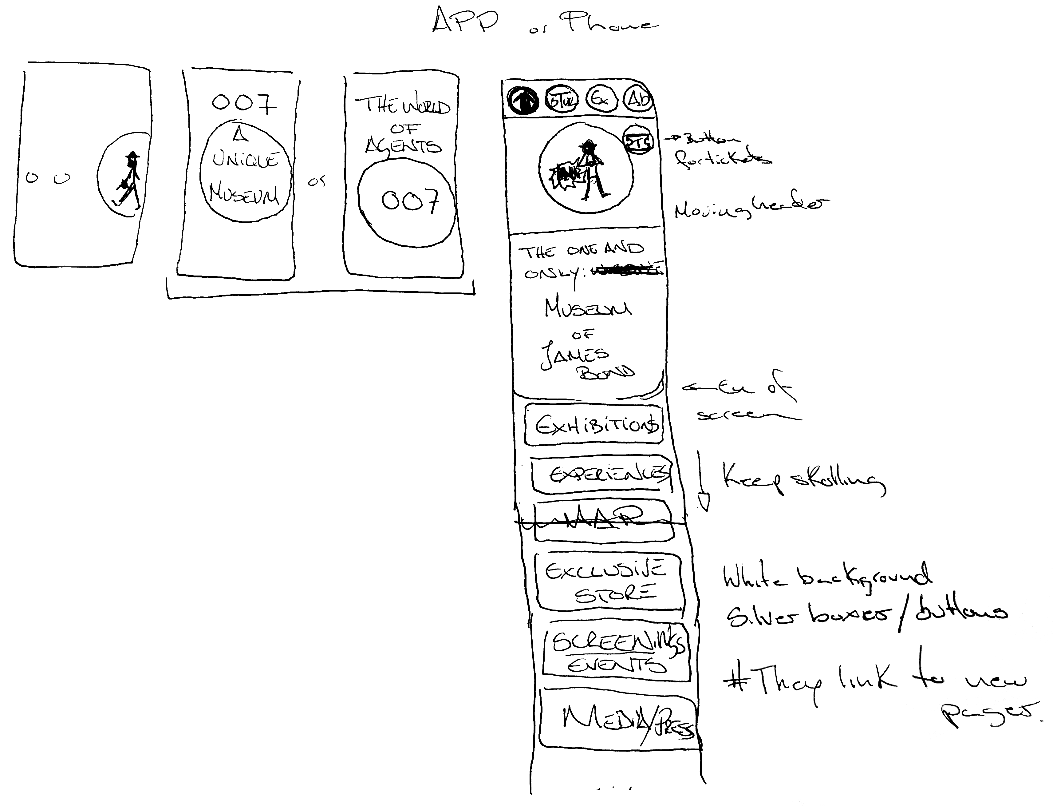
First Sketch
Stepped Interaction
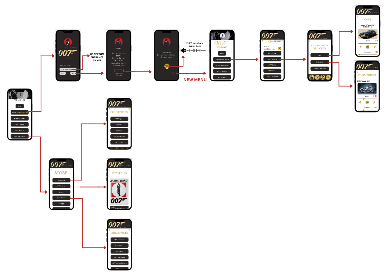
Prototype 1 → Final
User Testing
Participants
10
Age Range
20–60
Question Script
14
Tests Conducted
6
Testing happened in two distinct phases, with a clear division of purpose.
4 participants (website research phase). Before any design started, 4 users were interviewed to understand how they experienced the existing museum website: what confused them, what they missed, and what would motivate them to visit. This shaped our information architecture and content priorities.
6 participants (usability testing phase). Once the prototype was built, 6 users tested the app directly using our scripted interview. I personally conducted 2 sessions; the rest were run by my teammates. Ages ranged from 20 to 60, intentionally broad to validate the design for both the existing fan base and the new audiences we were designing for.
What we found
Website (before)
"Boring, sterile, nothing gives the impression of James Bond."
Users couldn't navigate backwards without a home button. Content felt overwhelming and uncategorised. The design failed to communicate what made the museum worth visiting.
App prototype
"Has all the Bond symbols, gives a good feel, makes me want to visit."
Older users navigated the app more smoothly than the website. The cinematic loading sequence landed well. Brand consistency and simplicity were the key wins.
What changed: Iteration 1 → Iteration 2
Back Navigation
Found: Younger users on laptops consistently struggled to navigate backwards using swipe gestures.
Fixed: Added an explicit CTA back button on every screen, aligned with Nielsen's 'User Control and Freedom' and 'Error Prevention.'
Language Access
Found: Both age groups asked for multiple language options. The museum is in Sweden but attracts international tourists.
Fixed: Language switching added to the prototype scope and prioritised as a core feature.
Content Discoverability
Found: Users wanted to explore freely, zoom into exhibit images, browse without a forced path.
Fixed: Reinforced progressive disclosure so users could dig deeper on any exhibit rather than only seeing summaries.
Brand Consistency
Found: The prototype felt more Bond than the original site, but participants wanted more iconic symbols throughout.
Fixed: Strengthened visual consistency: gold Immersive/Limited labels, Bond silhouette motifs, sound effects in the audio tour.
Final Design
The final prototype delivered a complete app concept with two core functions: a booking and merchandise hub, and an immersive museum companion experience.
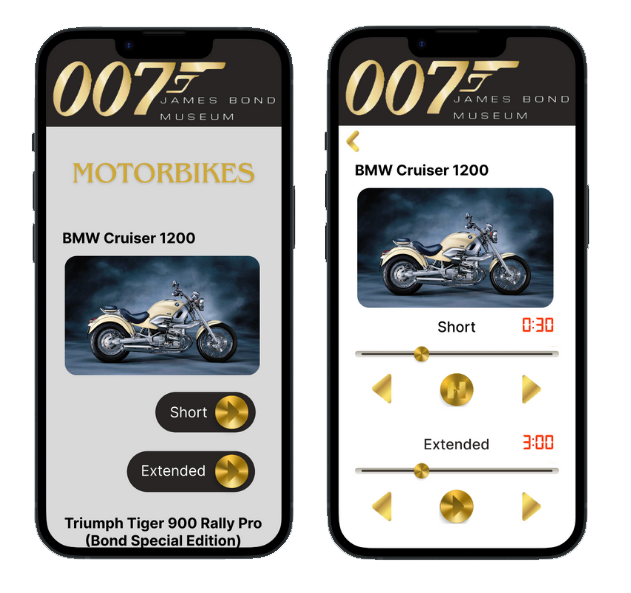
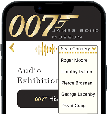
AI Audio Tour
Each exhibit is narrated by an AI-generated iconic James Bond voice, visitors choose their favourite actor. Short clips (15–30 seconds) give quick context; extended versions (3+ minutes) go deeper for those who want full immersion.
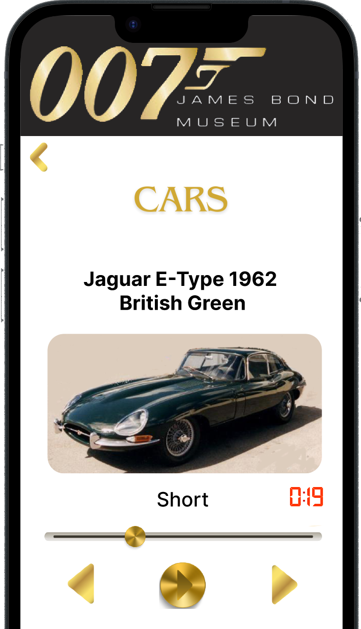
Press play for Sean Connery sample
Exhibition Explorer
Progressive disclosure and discoverability were central design principles, mirroring the museum itself: a large warehouse with many rooms and a rich, somewhat chaotic display of 007 collectables. The app brings order without stripping the sense of discovery. Category-based browsing (Cars, Gadgets, Costumes, Cinema) with zoomable images lets visitors set their own depth. Short audio clips serve the curious; extended versions reward the devoted. A persistent bottom navbar, Museum, Store, Map, News, keeps all key sections reachable at any point in the experience.

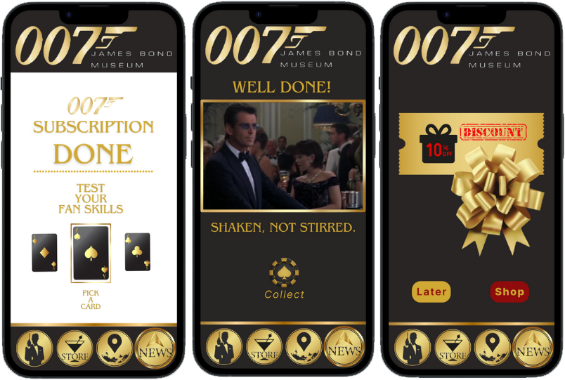
Booking, Ticketing & Merch
Designed for two types of users: one-time visitors and returning fans. Ticket holders unlock the full audio tour for a set time window; the merch store is open to everyone regardless of ticket, making it easy for fans, tourists, and family members of 007 enthusiasts to browse and buy. A persuasion layer built around fan trivia questions and point rewards redeemable for discounts encourages return visits and deeper engagement with the product catalogue, respectfully inspired by engagement mechanics, but grounded in 007 lore.
Brand-Authentic UI
Black and gold palette, Bond silhouette motifs, gunbarrel loading sequence: an extension of the franchise, not a generic museum app. A key feature is the actor voice selector: a dropdown of all 007 actors lets each visitor choose their Bond. This preserves the personal memorabilia magic every fan carries, creates entirely different storytelling experiences across visits, and deepens immersion in a way that makes returning worthwhile.
Final Prototype:
Figma Finished Prototype APPOutcome
The project delivered an innovative conceptualization of a layered interaction platform: an experiential enhancement for both the museum's visitors and its business. It was submitted to the course Visualizationand successfully applied the subject's core principles of grouping, information architecture and data layout, achieving a strong result.
Beyond the academic delivery, the conceptualization became a meaningful exercise in ideating solutions that serve multiple stakeholders at once: transmitting information effectively, expressing the priorities of a business like the museum, and making the case that cinematic culture can stay alive, relevant, and attractive to new generations through thoughtful digital design.
As a final note: the original museum website is no longer online. It is currently being redesigned. Whether or not our project played a part, there is something telling about a website that had become, across multiple Norwegian schools, a recurring case study in poor information hierarchy and ineffective use of data. Sometimes the most honest outcome is knowing the problem was real.
Reflection
This was one of the most inspiring projects I've worked on, the idea came from a personal place, and that energy carried through. Growing up with James Bond movies as a family ritual gave me a genuine feel for what the audience actually wanted, and in the end we over-delivered given the timeline.
The biggest lesson was about accessibility. The audio tour concept introduced an ethical problem I didn't initially see: an audio-first experience excludes deaf users entirely. We performed colour contrast checks and designed for cognitive diversity, but we didn't include disability demographics in our research strategy from the start, and that showed. A settings panel allowing users to customise the experience for different needs should have been part of the core specification, not a future consideration.
What this project reinforced: inclusive design is not a layer you add at the end. It starts with the questions you ask in research. And iterative testing, even with a tight deadline, is the fastest route to a design that actually works, not just one that looks good.
Tools: Figma · Adobe Photoshop · Canva · ChatGPT · 101Soundboards
Deep thank you to my team