
Arbeidsvarsling
UX/UI redesign of a roadwork documentation system
Arbeidsvarsling is a live, commercially licensed product owned by Triona AS. The original interface is confidential and not shown here. Everything you see was created by the project team during the redesign: prototypes, implemented screens, and design decisions.
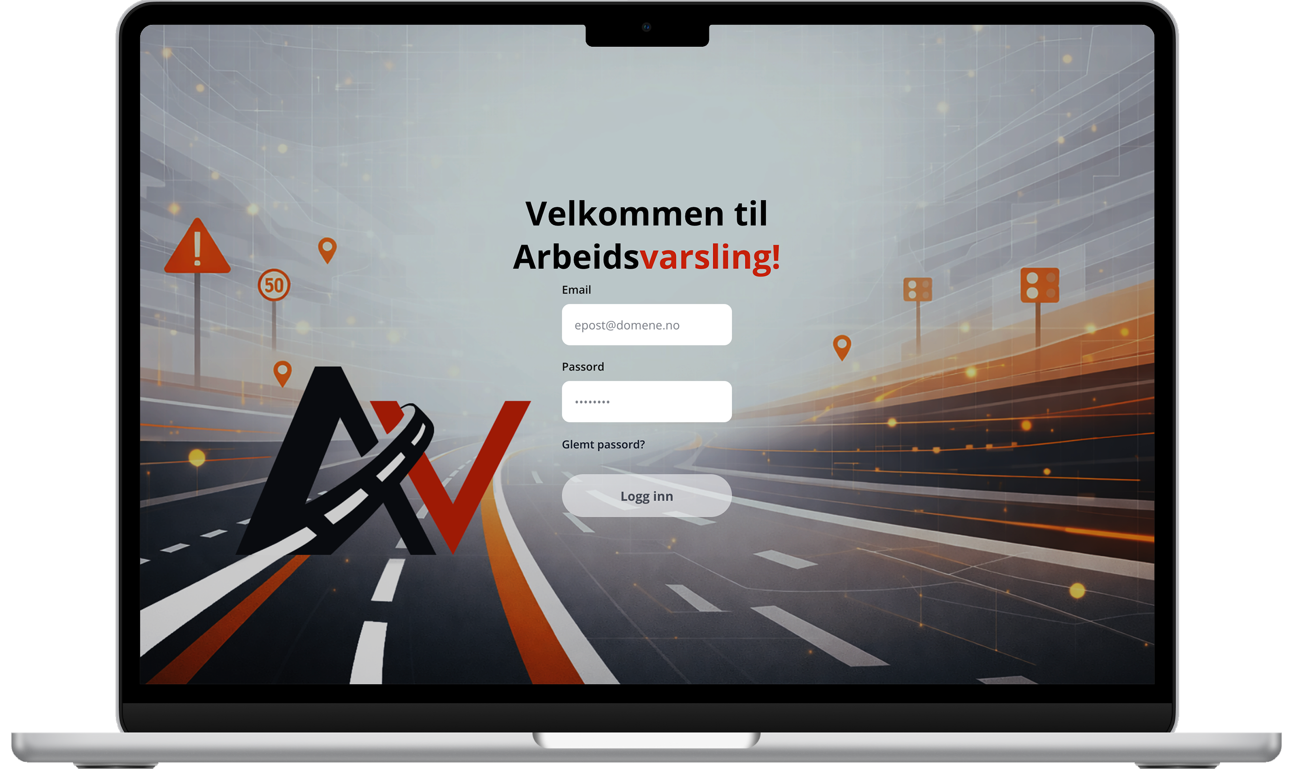
Web Application
The coded frontend, built in React and TypeScript. This is the version delivered to Triona and confirmed for production adoption.
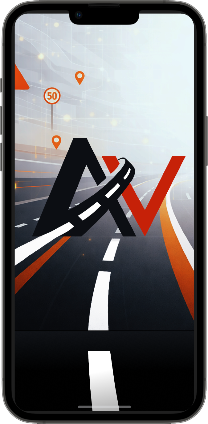
Mobile Concept
A Figma prototype created for the defence presentation to demonstrate how the redesigned workflow and logbook experience could extend across platforms. Not part of the original project scope.
Project Overview
Arbeidsvarsling is a two-part system built for roadwork safety documentation: a web platform used in the office to administer users, import approved traffic plans and manage equipment, and a mobile app used in the field to timestamp and GPS-stamp when safety signs are placed and removed. Together they replace paper logbooks with a fully traceable digital record that satisfies Statens vegvesen compliance requirements in Norwegian operations contracts.
Around 10,000 users across 450 companies depend on it daily across Norway and Sweden. The redesign was confirmed for production adoption by Triona, and in 2025 the platform launched in Denmark under the name Skiltelog, with expansion into Sweden and Finland underway.
Context
The system had not received a meaningful update since 2013. Its Java PrimeFaces frontend had fallen far behind modern usability expectations, and the gap had been papered over with workarounds: new users required an onboarding workshop, dedicated consultancy support, and a 46-page instruction manual before they could operate independently. Triona AS initiated this bachelor project to explore a full redesign using user research, design thinking, and a modern React and TypeScript stack.
Triona AS develops digital infrastructure and traffic management systems for Norwegian municipalities and large contracting companies including Mesta, Ramudden, Safe24, and Trafikkdrift. Their users are not primarily technical people. They are operations managers, coordinators, and project managers who use Arbeidsvarsling at minimum 70 times per week to keep roadwork documentation compliant and traceable.
The group worked from Triona's offices three days a week for the full project period, following professional development standards: feature branches, pull requests, code reviews, and sprint reviews with the client. The solution was expected to be of real production quality, not a student prototype.
The Challenge
How can the frontend of Arbeidsvarsling be redesigned to improve usability, simplify workflows, and provide a more intuitive user experience, while preserving the system's operational purpose?
46
Page instruction manual
New users needed a full onboarding manual before they could operate the system independently. No interface should require a textbook.
3
Core pain points
Equipment list management, draft workflow that was almost never used, and a time-consuming logbook admin process identified through research as the biggest friction areas.
70+
Uses per week, per user
The system is deeply embedded in daily operations. Every workflow inefficiency compounds across hundreds of interactions per month.
My Role & Contributions
Within a team of three, I led the UX research and visual design work from start to finish. My background in Human-Computer Interaction shaped how we approached user understanding, and my design instincts drove the visual language of the redesigned system.
UX Research Lead
Designed and led both rounds of user interviews, co-developed the survey strategy, and conducted the heuristic evaluation against Nielsen's ten usability principles, Universal Design, and WCAG 2.1.
Visual Design & Brand
Created the redesigned brand identity including the app logo and background assets in Photoshop. Led the Figma prototyping work across both iterations, establishing a consistent visual system for the interface.
Frontend Development
Contributed to the React and TypeScript implementation alongside the team, working within Triona's professional Git workflow: feature branches, pull requests, and code reviews before each merge.
Research
Research ran through the entire project, not just the opening phase. Three methods built on each other: a heuristic evaluation gave us a structured expert baseline, interviews gave us depth and workflow context, and a survey validated findings at scale across the full user base.
Pre-Analysis: Heuristic Evaluation
The team went through the same onboarding process as a new user: the 46-page manual, followed by a systematic walkthrough of every page in the application, where the product owner also gave the team insight on the main complaint issues they wanted to explore new possibilities for.
Evaluators
3
independent reviewers
Screens
11
Findings
52
Avg. severity
3.61 /4
Nielsen's severity scale (0–4)
Top 10 problem areas by severity
Equipment selection
Dropdown shows 5 of 16 categories with 3+ second reload per interaction. No saved templates or reusable groupings. Compounds on wide screens where layout leaves most of the page empty.
Draft workflow
All plan creation forces Draft status with no 'Activate and Save' option. 84% of users rarely or never use drafts, creating risk of forgotten inactive plans affecting field operations.
Dashboard purpose
Near-duplicate of the plans page. No summary widgets, calendar, map, or at-a-glance status overview for decision support.
Navigation structure
All navigation behind a single hamburger menu, flat list mixing page links, admin functions, and documentation. No persistent sidebar, breadcrumbs, or page indicator.
Form labelling
Date fields on legally regulated plan forms are unlabelled. Start and end dates look identical, risking compliance errors on administrative forms.
Error prevention
Destructive actions placed adjacent to read actions with misleading icons, no confirmation dialogs, and no undo mechanism.
Admin operations efficiency
User permission requests and bulk logbook downloads require cross-platform manual workflows. Repetitive and cognitively demanding for administrators.
Logbook visibility
Logbook status bars in the plans list are unlabelled. Coloured segments make it impossible to assess which logbooks need attention without opening each plan.
Terminology
The system has three plan statuses: Active, Closed and Completed. The last two were never clearly defined. Each team and company interpreted them differently, and one organisation stopped using Closed entirely, creating inconsistent documentation across the platform.
Wide-screen usability
Table exceeds viewport width requiring horizontal scrolling. Equipment images disproportionately small on wide monitors, violating WCAG 2.1 SC 1.4.10 Reflow.
User Interviews, Round 1
Participants
2
expert users
Duration
~1hr
per session
Format
Semi-structured
Protocol
Think-aloud
01
Equipment selection bottleneck
Equipment categories were hidden behind a dropdown showing 5 of 16 options at a time. Each category switch triggered a 3.02s reload. No way to save or reuse sign configurations, so the same setup was rebuilt from scratch every session.
02
Error-prone plan creation flow
Creating a plan in the existing system automatically saved it as a draft with no option to activate it immediately on completion. Users could finish filling in a plan and leave it inactive without realising, meaning field workers arrived at worksites without access to the equipment list. A compliance risk in a legally regulated service.
03
Logbook status hard to read
Logbook completion was indicated by a coloured progress bar overlaid directly on the plan row. The bar could partially or fully cover the text beneath it, making the status label unreadable. The visual encoding was not intuitive, and on some rows the overlap made it impossible to tell what the bar was communicating without opening the plan.
User Survey, Round 1
The survey was designed to validate interview findings at scale and quantify patterns that qualitative methods alone could not confirm. Two results were decisive: 84% of respondents said they rarely or never used the draft stage, confirming that a mandatory step in every plan creation flow was being absorbed as friction by the vast majority of users. Separately, multiple users independently and without prompting requested reusable equipment configurations and saved sign groupings, a need the team had not anticipated going in and could not have predicted without open-ended survey questions.
Personas developed from user interview and survey insights
Design Principles
After the first research iteration, mapping the frustrations and failure points of the existing solution, six principles emerged as central to the redesign. These were not abstract ideals but direct responses to what the heuristic evaluation and user research had surfaced.
Freedom and Control
Users needed direct access to every core action without navigating through hidden menus or mandatory intermediary steps. The redesign removed forced workflows and gave users control over when and how they completed tasks.
Visibility of System Status
Users managing multiple active plans simultaneously needed to understand the state of each without opening them individually. Logbook completion, plan activation status, and equipment readiness were surfaced directly in the plans overview.
Flexibility and Efficiency of Use
Frequent tasks needed shortcuts. Equipment configurations that were rebuilt from scratch daily became saveable groupings. Plan creation offered two direct entry points rather than a single mandatory flow, adapting to both experienced and new users.
Error Prevention
Arbeidsvarsling serves a legally regulated, safety-critical context. Compliance errors have real-world consequences on public roads. Destructive actions needed confirmation dialogs, plan activation needed to be explicit, and form fields needed unambiguous labelling.
Match between System and the Real World
The most visible change in the redesign was the introduction of a dashboard combining a live map of active worksites, a calendar view of plan timelines, and a status overview. Instead of a flat record list, users could see their work in space and time, matching the mental model of someone coordinating field operations across multiple locations.
Recognition over Recall
Equipment signs became a visual card grid instead of a dropdown list. Logbook statuses became labelled indicators. Plan states became readable at a glance. Navigation moved from a hidden hamburger menu to a persistent side panel, keeping all destinations visible at all times. The interface was redesigned to surface information rather than require users to remember where it was or what it meant.
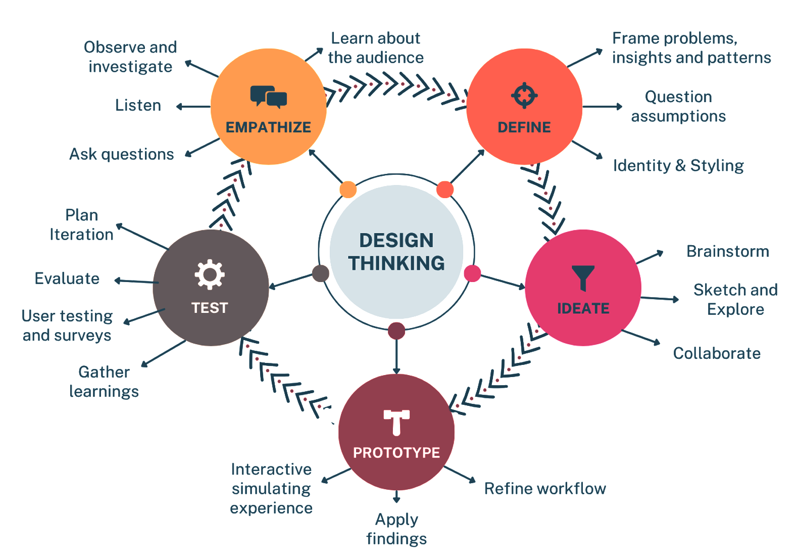
Design Process
The project followed Design Thinking across five phases: Empathize, Define, Ideate, Prototype, and Test. These were not sequential stages but an iterative loop, each round of testing feeding back into the next design decision. Agile Scrum structured the delivery into six three-week sprints, matching Triona's own internal workflow.
Five-phase Design Thinking loop applied across six Scrum sprints
Brand Identity
The existing system had no visual identity to speak of. Establishing one was the first step toward making the interface feel trustworthy and professional. I designed the app logo and visual assets in Photoshop, then built the colour system, typography hierarchy, and component patterns into Figma before a single prototype screen was drawn.
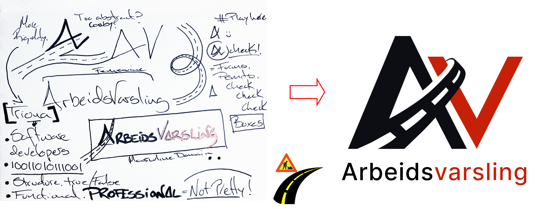
APP Logo
The logo began with hand sketches exploring the A and V initials from Arbeidsvarsling. The existing system had no web identity, only a mobile app logo. Reflecting on Triona's structural and professional character, the design combined a sharp A with a sweeping V suggesting both a road curve and a checkmark. Five versions were polled on Triona's Teams channel, followed by a second round of eight variations. The winning version initially used terracotta orange, but the team chose to favour alignment with the parent brand and switched to Triona's red. The final logo was then integrated into a road-work background using Photoshop.
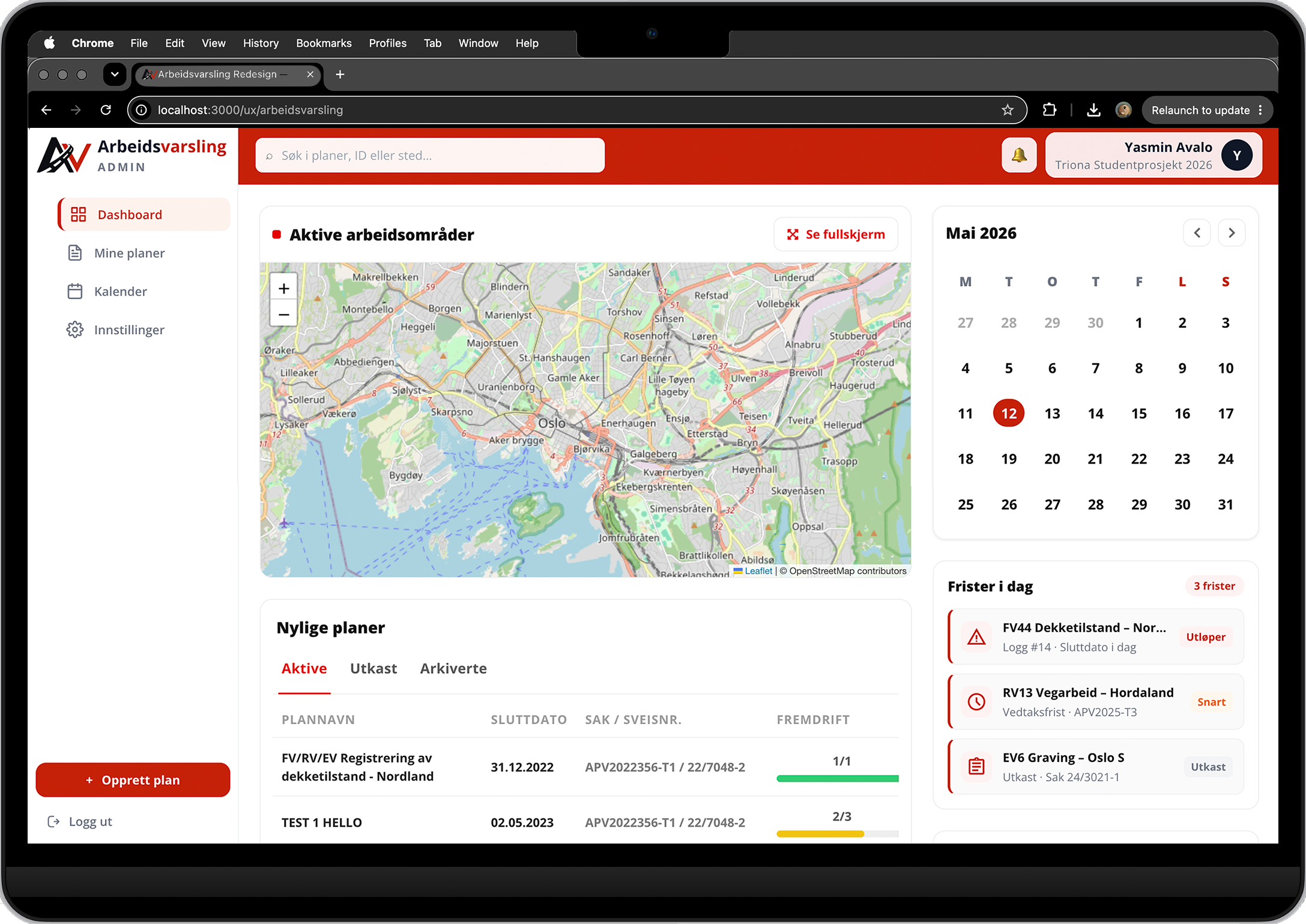
The redesigned dashboard as implemented in React. The original dashboard was a near-duplicate of the plans list with no decision-support value. The redesign introduced four distinct components: a live map of active worksites, a calendar view, a recent plans panel sorted by activity, and a deadlines section. The persistent side navigation is visible on the left, replacing the single hamburger menu that had hidden all navigation behind one click.
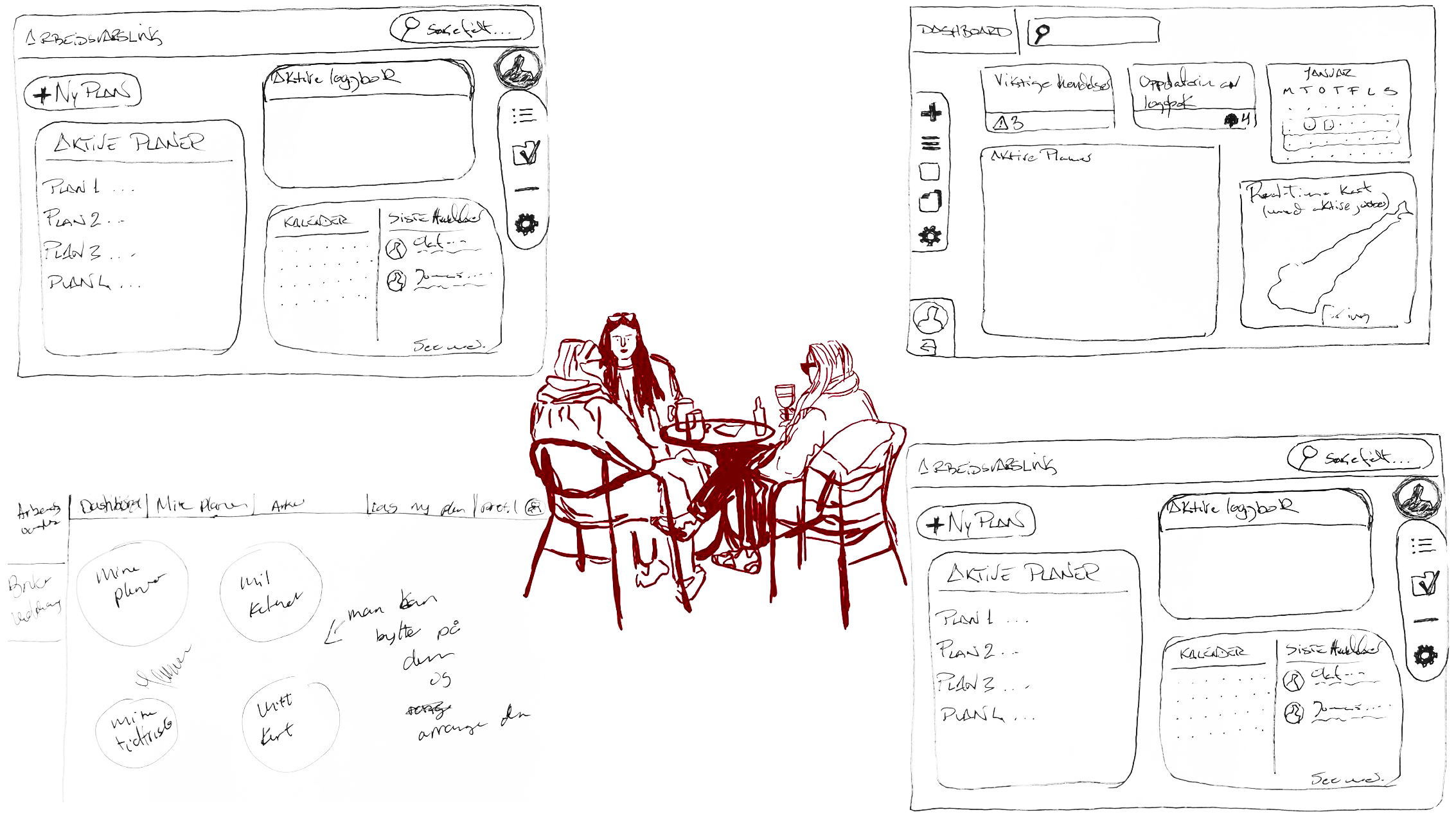
Sketching
Rapid sketching was used as a Design Thinking ideation method. Fast, low-commitment way to generate and compare layout directions before Figma work began.
Round 1
10 min
Individual sketching. Each member drew their own layout interpretation of the login page and dashboard with no discussion.
Round 2
10 min
Shared critique. Sketches were compared side by side. Each page was evaluated for what to keep, restructure, or remove before moving to Figma.
Collaborative design session documenting page-by-page decisions
Prototyping
Figma was chosen because it allowed real-time collaboration, maintained visual consistency across contributors, and produced clickable flows that users could navigate as if they were inside the actual application. Two full prototypes were built: an initial version tested with expert users, and a refined second version based on those findings.
Qualitative Testing
Figma · Interactive flows
2 expert users
The first prototype covered the login page, dashboard, plan list, and equipment management flow. It was designed to test navigation clarity and the restructured information hierarchy before any development work began.
Found: Users navigated clearly but requested more visible status indicators on active plans. The equipment assembly flow still required too many steps.
Changed: Status labels added to dashboard cards. Equipment category filtering consolidated into a single accessible panel.
View prototype in Figma →Quantitative Testing
Figma · A/B Test · Likert Scale
26 respondents
The second prototype incorporated all findings from the first round of testing. An A/B test was run with two groups: one viewing the prototype with a demo video, one without. Both groups rated the redesign against the same structured statements.
Found: 92.3% rated navigation positively. 84.6% agreed the plan creation flow was clear and logical.
Changed: Final visual polish applied across all screens. Logbook flow condensed and admin steps reduced.
Demo Video Prototype for Test →Findings Implementation
React · TypeScript · REST API
Triona dev team
The implemented frontend was built in React and TypeScript, matching Triona's chosen modernisation stack. Components were structured for reuse and maintainability, with routing, API integration, and a sidebar navigation system built from scratch.
Found: 14 of 17 defined requirements fully fulfilled. 3 partially fulfilled due to API endpoint availability constraints, not design decisions.
Changed: Core flows, dashboard, and equipment management delivered and reviewed by Triona. Design confirmed for production adoption.
Final Coded Prototype
The delivered product is a fully coded React and TypeScript frontend. What follows covers the screens where research findings directly drove design decisions. Not all screens are shown; this selection focuses on the key areas where usability issues were identified and addressed.
Final React implementation delivered to Triona
Comparative Heuristic Evaluation
A second heuristic evaluation was conducted after the React implementation to measure the actual impact of the redesign. The same ten areas were scored against the same 0–4 severity scale used in the pre-analysis.
Equipment
4.0 → 0.1
Dashboard
3.7 → 0.5
Navigation
3.7 → 0.0
Draft workflow
4.0 → 0.0
Logbook visibility
3.3 → 0.4
Form labelling
3.7 → 0.0
Wide-screen
2.7 → 0.9
Terminology
excluded
Error prevention
3.7 → 1.3
Admin operations
3.7 → 0.3
89%
severity reduction
3.61→0.39
average severity (0–4 scale)
!! Confirmation Bias Warning
The same methodology as the pre-analysis was applied, but this time the reviewers were the designers themselves. To reduce subjectivity, each team member scored independently before any discussion, and findings were cross-referenced against data already collected from user surveys, prototype testing, and interviews. Scores were only aligned where external evidence supported the assessment.
A rigorous evaluation would require 3 to 5 independent reviewers unfamiliar with the design. Time pressure was our constraint. This evaluation was used purely as a directional measurement: a structured before and after comparison, not a validated usability verdict.
Results & Impact
92.3%
Rated navigation positively
Going to production
Triona AS confirmed, both verbally and in writing, that the redesign will be used as the foundation for upcoming production updates to Arbeidsvarsling. This was not part of the original expectation. The work exceeded what the client had anticipated from a bachelor project.
14/17
Requirements fully fulfilled
“This is what Arbeidsvarsling should look like. I'm impressed!”
User feedback, prototype presentation
“Can't wait to use this.”
Expert user, second round testing
Feedback collected from Triona AS stakeholders during the all-Scandinavia internal presentation
The redesign was presented internally to Triona teams across Scandinavia. Feedback was collected from stakeholders across roles.
Product Owner
HR Manager
Project Manager
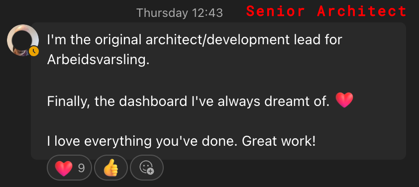
Senior Architect
Reflection
Research earns the design
Every significant design decision we made was grounded in something we had heard or observed from actual users. That is not a methodology choice, it is a discipline. Without the 107-person survey and the expert interviews, we would have been designing for assumptions.
Work inside the client's world
Being embedded at Triona three days a week changed the quality of the output. We understood the culture, the constraints, and the stakes. That proximity shaped decisions that a remote brief never could have surfaced.
Survey design is a skill in itself
The first survey produced rich data but was costly to analyse. Open-ended responses from 107 people take significant time to categorise. The second round used structured Likert scales with better results. Earlier structure, same insight.
Looking ahead
The redesign provides Triona with a solid, tested foundation. The next step is full production integration, including the remaining three partially fulfilled requirements around plan editing, complete logbook management, and full API coverage. The design system established in Figma is ready to extend. What was built here is a beginning, not an endpoint.
Tools: Figma · Photoshop · React · TypeScript · Azure DevOps · Notion