
Tech Assistant
Gamified learning platform for IT students
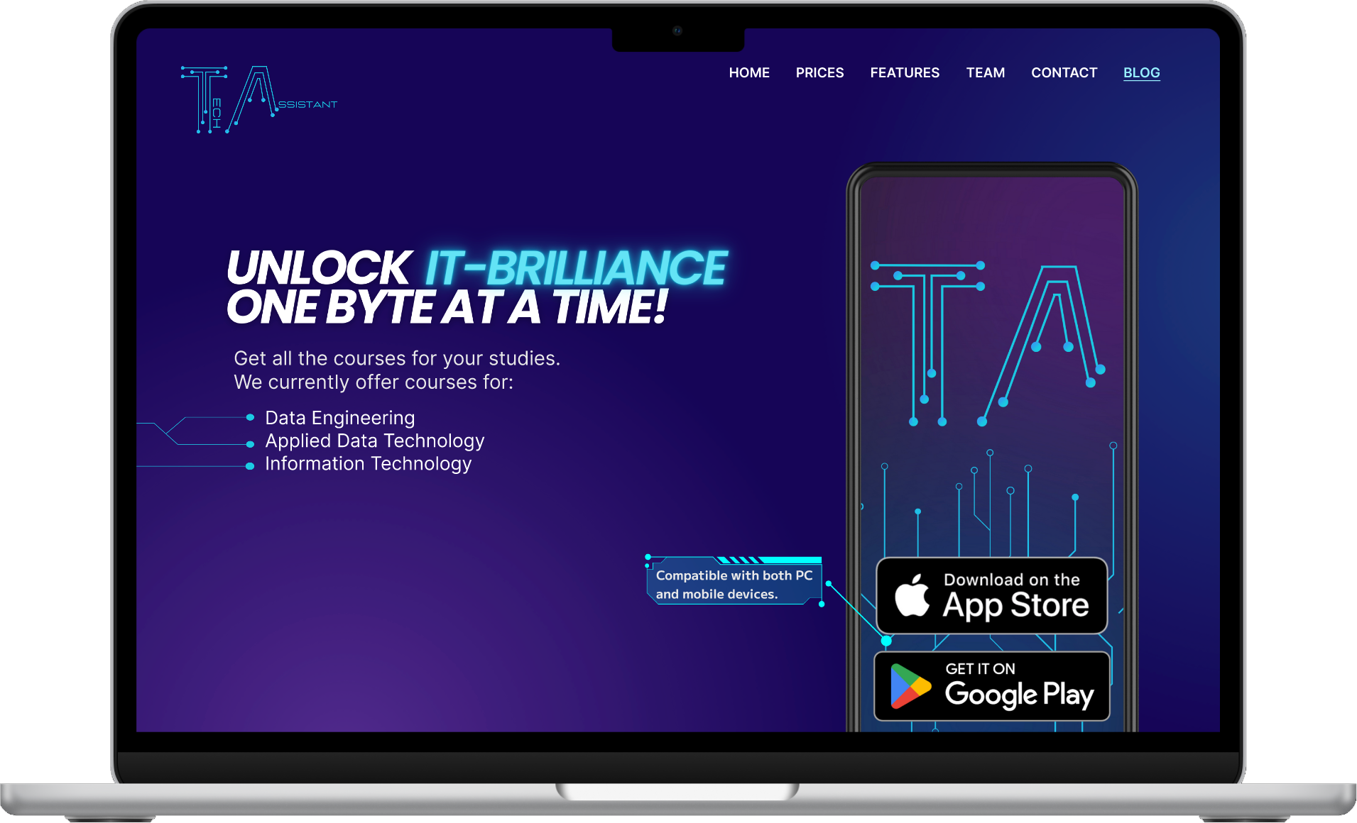
Web Platform
Currently the product's public face, presenting TA's concept and value to students, institutions, and partners. Future development will bring the full learning platform to the browser.
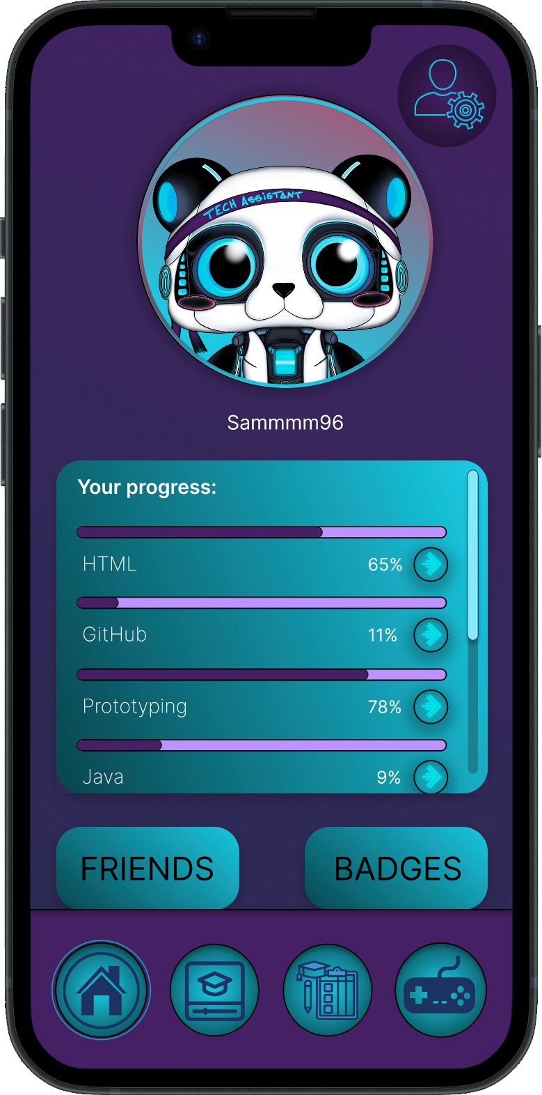
Mobile App
The core study companion. Connected to enrolled courses and curriculum, it lets students learn, practice with games and flashcard sets, and access a Sanctuary stress-relief module for high-pressure moments.
My work was focused on the app design and development. The website was designed by a colleague, with close collaboration and ongoing shared decisions throughout the project.
Project Overview
At OsloMet, “TA” means Teaching Assistant, the go-to support for students in courses with 400+ enrolled. But TAs were overstretched, students felt left behind, and lectures alone were not enough. For the course Prototyping, our team of 6 was tasked with exploring how IT could solve a problem of our choice. We chose education.
Our answer was Tech Assistant (TA): a gamified mobile and web platform that supplements university learning with interactive content, personalised pathways, and a community layer, so students can keep up, stay motivated, and never feel alone in their studies.
The concept went through three full iterations: paper sketches, mid-fidelity digital prototype, and a high-fidelity final product, tested with real students at every stage.
High-fidelity prototype:
View in Figma →Context
Research shows that traditional lectures rank among the least effective methods of retaining information, with only 10% retention. Gamified and interactive formats can push that to 75%. Students increasingly turn to YouTube, Canvas, and paid apps to fill the gap, but these platforms are fragmented, inconsistent, and not aligned with their specific curriculum.
At Norwegian universities, Teaching Assistants are meant to bridge this gap, but with class sizes of 400 or more, individual support becomes impossible. Students are left to navigate dense material alone, often without knowing where to start. Our own survey of 39 students confirmed this: 15.5% felt lectures contributed too little to their learning, and 66.7% said they would use a learning app to support their studies.
TA was designed to be that app, not a replacement for teaching, but a 24/7 accessible, gamified, student-built supplement that meets students where they actually are.
Challenge
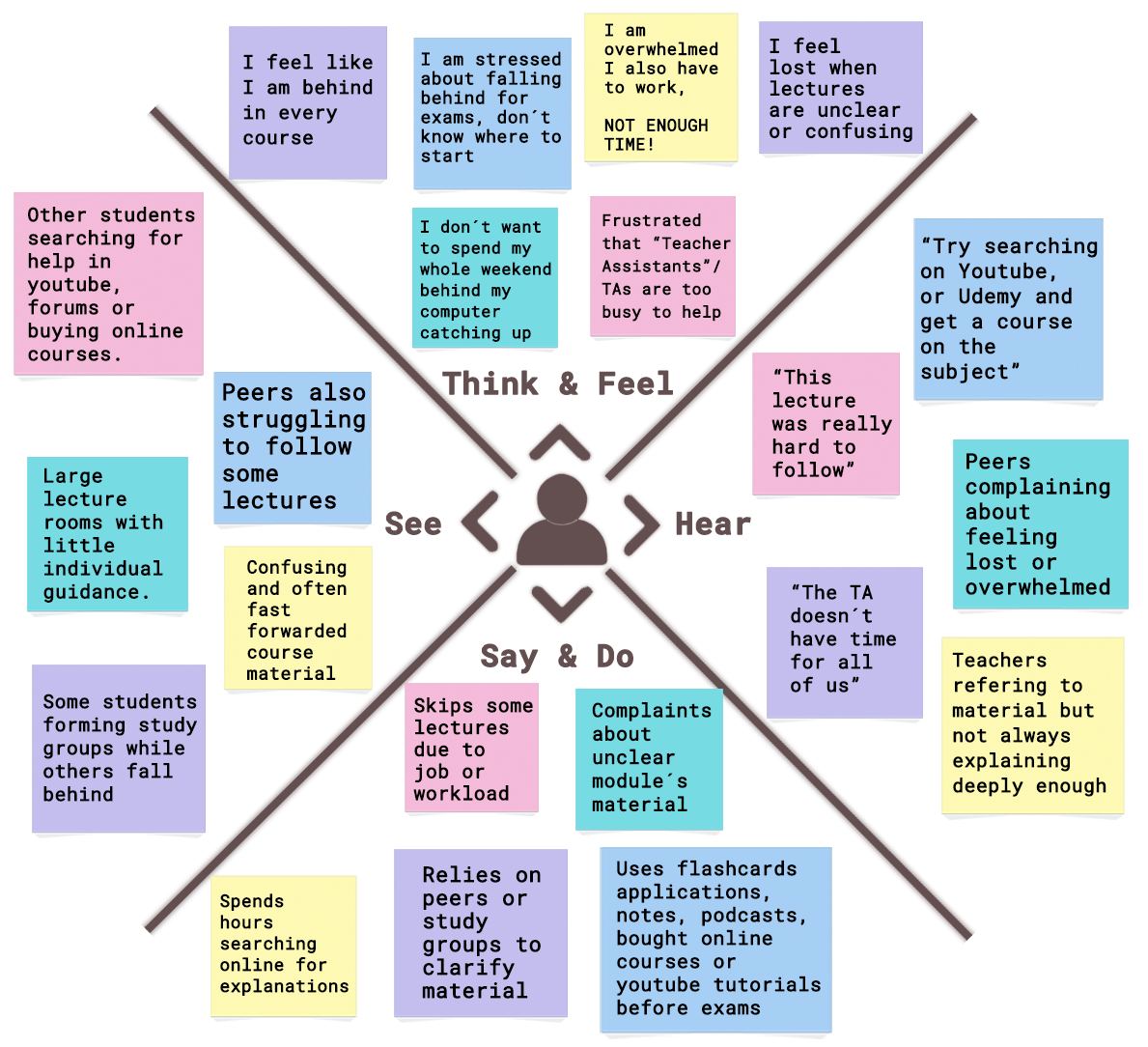
We were all students ourselves, which gave us an unfair advantage. Rather than guessing what the problems were, we went directly to our peers and intentionally asked fellow IT students, across different years, to walk us through their experience: what was hard, what was frustrating, what made them want to give up. We listened, gathered every thread, and mapped it all into a shared empathy map. Four pain points kept coming up, not in isolation, but always together.
Time
Busy schedules, missed lectures, and difficulty catching up meant students needed flexible, on-demand access.
Engagement
Lectures were described as confusing or boring. Students needed interactive formats that made content stick.
Accessibility
Materials were hard to follow for students with different learning styles, languages, or backgrounds.
Community
Students wanted peer-driven support. Feeling isolated while studying was a recurring theme in our research.
Empathy map: student pains and opportunities
Research
We ran one quantitative Google Forms survey at the start of the project, mapping the real need for the product before any design decisions were made. It targeted how students experience lectures, how they find resources online, and their openness to a learning app. In total, 39 IT students responded, spanning different years and including TAs. This data drove every early design decision.
Learning from lecturers
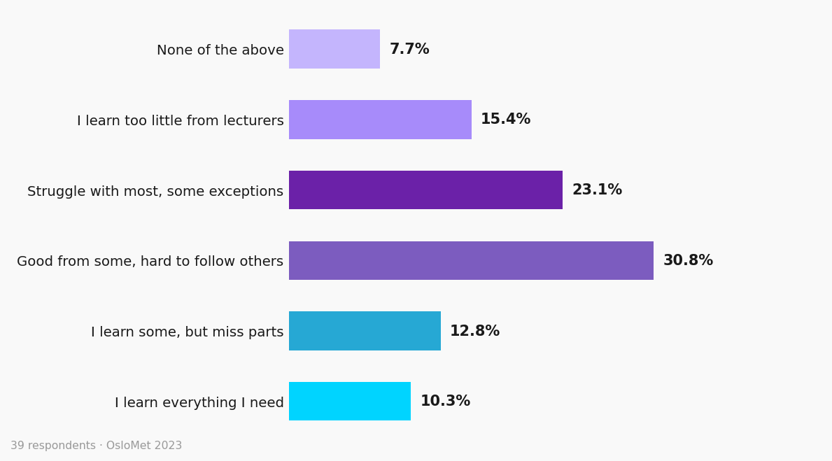
How much do you feel you learn from your lecturers?
Learning at lectures
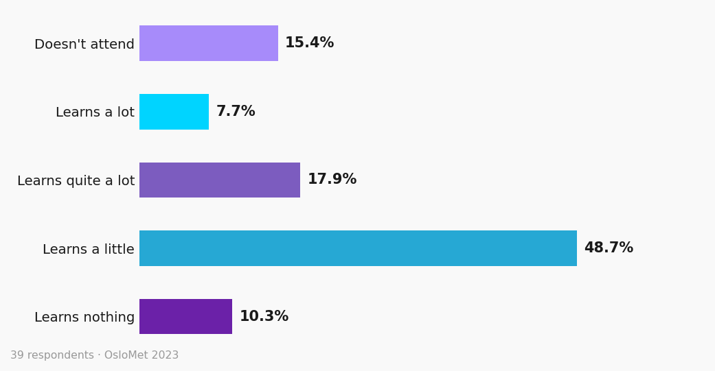
How much do you learn during a lecture?
Finding resources online
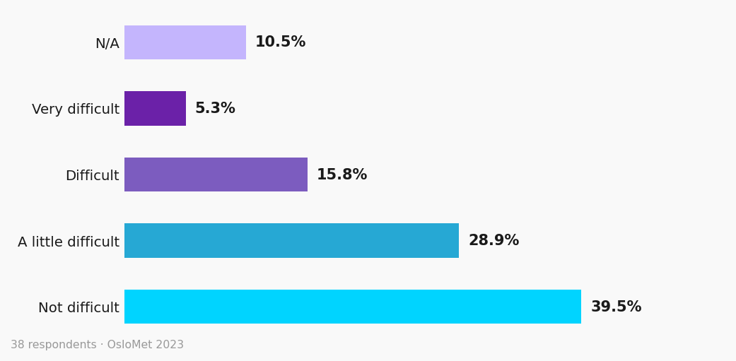
How hard is it to find curriculum-relevant resources online?
Openness to a learning app
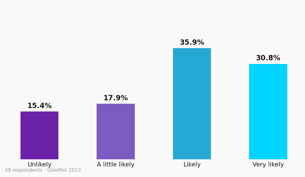
How likely would you use an app to study your curriculum?
Social influence on adoption
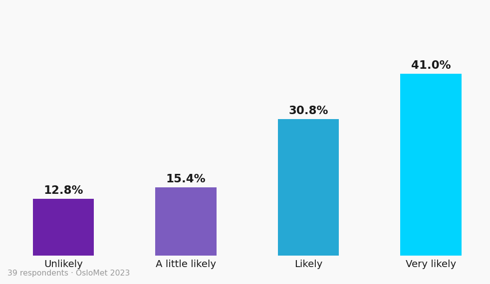
How likely would you download it if fellow students used it instead of notes?
Top requested features
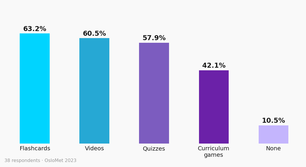
Which features would you want in a learning app?
Key findings
66.7%
of students said they would use a learning app to supplement their studies.
63.2%
requested flashcards as a core feature, followed by videos (60.5%) and quizzes (57.9%).
85%
improvement in student performance documented in studies using course gamification (Verma, 2023).
Vision
Unlike the human TA role, the digital Tech Assistant was envisioned as a scalable, accessible platform updated directly with the university syllabus and curriculum. The goal was a tool where students could:
Content aligned with your syllabus
Synced directly with higher education standards and curriculum, so students always have access to what they are actually studying.
Inclusive formats for every learning style
Closed captions, text-to-speech, and translation support designed so no student is left behind, regardless of language or background.
Gamification that keeps you going
Points, streaks, badges, and leaderboards turn the study routine into a motivating loop, not a chore.
Techie, your 24/7 AI guide
An interactive panda mascot always one tap away, offering guidance, tips, and support without replacing the human TA.
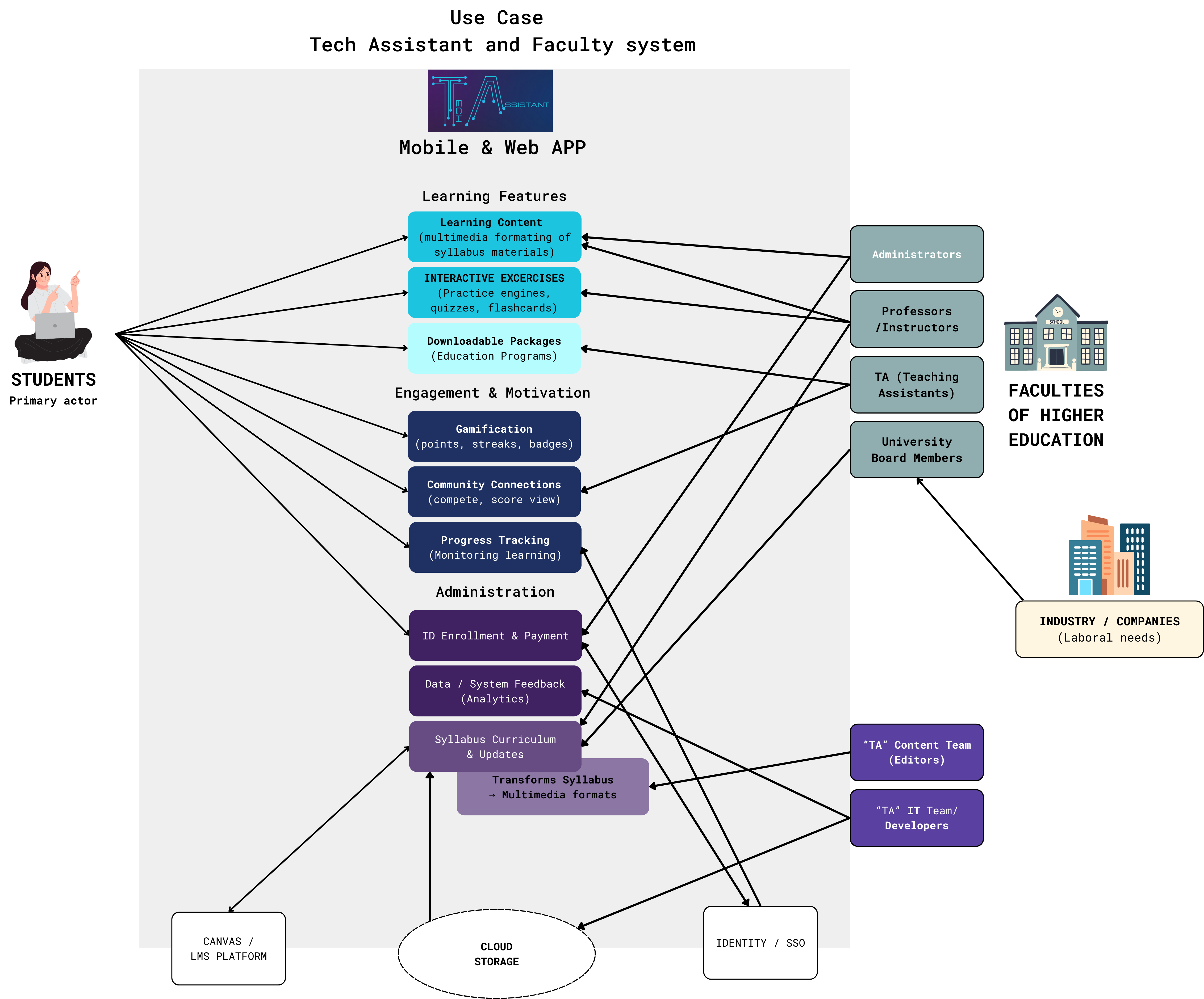
Use Case: Tech Assistant and Faculty system
Design Principles
Five principles guided every screen, ensuring the platform was engaging, accessible, and genuinely useful for students with different needs and backgrounds.
Gamification
Points, streaks, badges, and leaderboards turn learning into a motivating loop, not a chore.
Progressive Disclosure
Content revealed step by step. Students choose their depth without being overwhelmed on arrival.
Inclusivity
Captions, text-to-speech, and translation support designed for diverse learning styles and language backgrounds.
Community
Peer sharing, social motivation, and collaboration features reduce isolation in large-cohort courses.
Curriculum Alignment
Content synced directly with university syllabi so students always have access to relevant, up-to-date material.
My Role & Contributions
This was a group project of 6. Five of us worked consistently in person, one member contributed remotely from abroad. Three areas were mine alone: mascot creation and multimedia, all A/B paper sketch prototypes, and every Figma screen from low to high fidelity. User research, testing, and analysis were shared equally across three to four members.
Mascot & Multimedia
Created Techie the panda mascot from scratch using Procreate Pro. Made animated GIFs to simulate in-app animation and edited video presentations for the final delivery.
UX Design & Prototyping
Designed and refined the prototype across all three fidelity levels, translating survey and testing insights into concrete design adjustments for navigation, onboarding, and the dashboard.
Testing & Analysis
Conducted and analysed all test sessions across iterations. Adapted questions in real time during sessions. At the final high-fidelity stage, reached out to a professional UX designer friend to get an external perspective on the project.
User Research
Contributed in creating the initial quantitative survey, used to map student needs and validate the product direction before design began.
Personas & Use Case
Contributed to persona creation and the use case diagram, and designed a user journey for the mid-fidelity prototype. These documents clarified TA's role as a collaborative platform for different end-user profiles.
Collaboration & Vision
In reflections, I drove emphasis on accessibility features and inclusivity within learning formats, advocating for captions, text-to-speech, and custom profile editing, even when time constraints pushed them to the next iteration.
Ideation and Initial Conceptualization
All 6 team members sketched interfaces independently, each exploring different layouts and flows. Those individual concepts were then brought together as a group, compared side by side, and the strongest ideas from each were merged into one shared direction. These sketches became the ground for the mobile app version, while a colleague led the web version in parallel, both informed by the same combined concept.
Low-fidelity sketches, all 6 team members, round 1
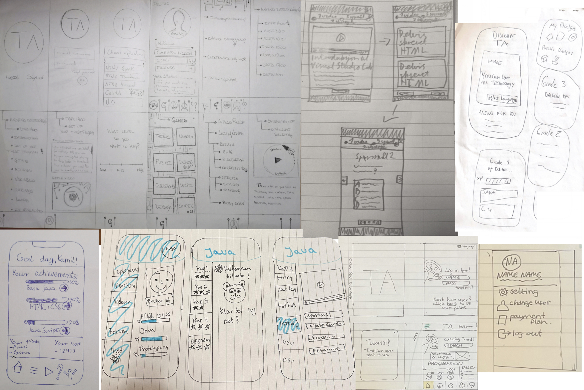
Group drafting, app and web prototypes compared
Design Process
The project followed an iterative, user-centred approach. Rather than designing in one linear pass, each phase was built on the findings of the previous one. Research shaped the initial concept. Low-fidelity testing challenged it. Mid-fidelity testing refined it. High-fidelity testing validated it. At no point was the design considered complete until the next round of users told us otherwise.
This agile loop, discover, design, test, adapt, repeated across three full iterations, kept the product grounded in real student behaviour rather than in team assumptions. The decisions that made it to the final prototype were not creative choices. They were earned through evidence.
User Testing
Testing was embedded into every phase, not treated as a final checkpoint. Each fidelity level had its own test format, its own participants, and its own set of questions. Findings were acted on before the next iteration began.
Low-Fidelity
Paper prototypes · A/B format
2 participants
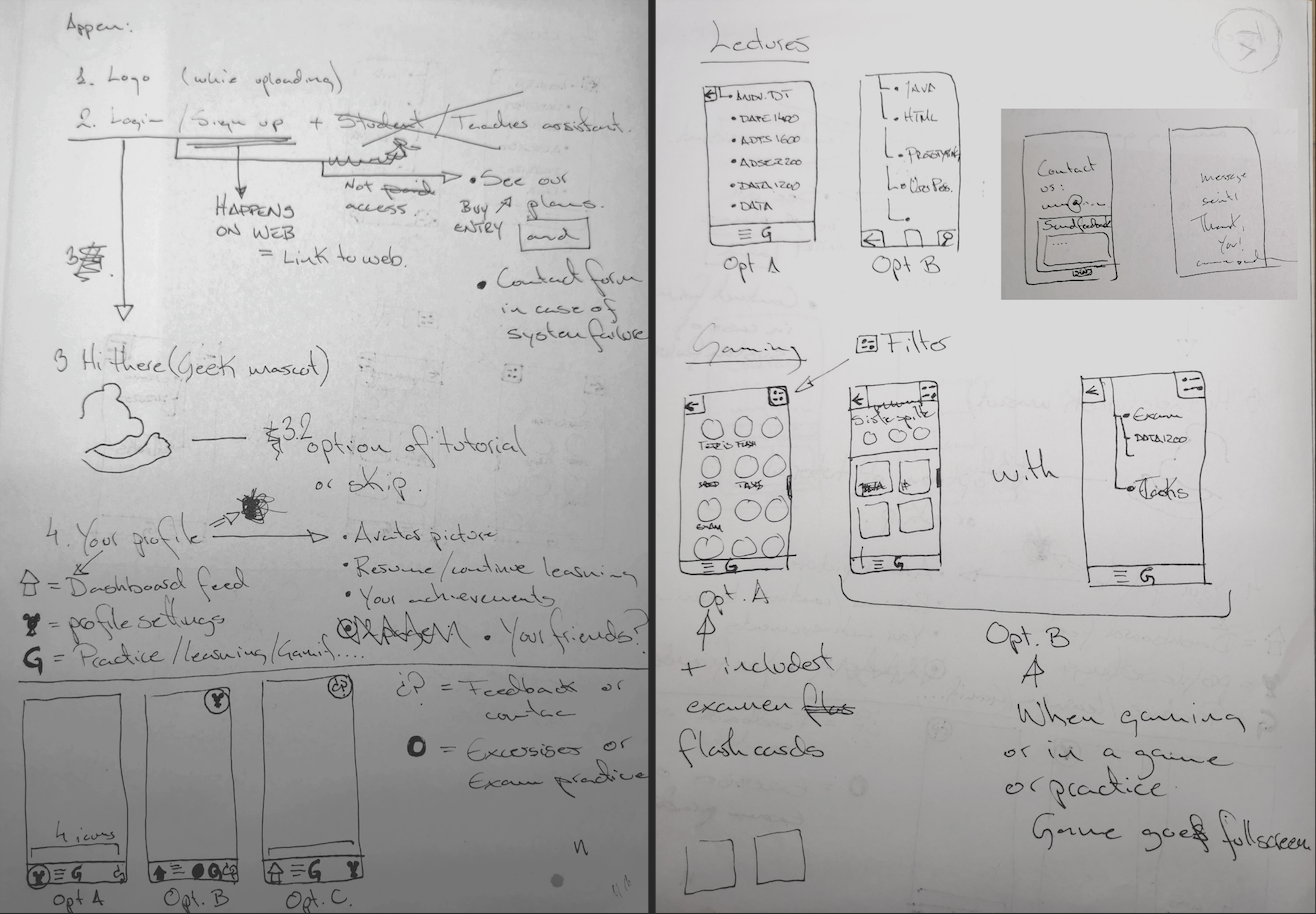
Each team member sketched their own concept independently. Two versions (A and B) were built on paper and tested side-by-side through in-depth interviews and task observation.
Found: Users preferred the single-scroll flow of Concept A but found specific interactive elements in Concept B simpler and more intuitive.
Changed: Merged the strongest ideas from both concepts into one unified direction before moving to digital.
Prototype A

Prototype B
Mid-Fidelity
Figma prototype · Script-based
5 participants
A structured test script was used across one-on-one sessions with five student participants, focusing on navigation, design coherence, and content clarity.
Found: Navigation between sections was unclear. The value proposition on the first screen was buried. Pricing page lacked course depth. Mascot purpose was ambiguous. Students expressed strong interest in study games such as flashcards.
Changed: Anchored bottom navigation with five fixed sections. Rewrote onboarding to lead with the core benefit. Added a dedicated course page with flashcard and quiz modes. Defined Techie as the in-app AI guide.
View in Figma →High-Fidelity
Full UI prototype · Semistructured interviews
3 students + 1 professional
The high-fidelity prototype was tested with three student users through semistructured interviews, and additionally reviewed by an external professional UX and UI designer/developer, brought in to provide perspective beyond the student context.
Found: Overall positive reception. The visual identity, gamification layer, and Techie integration were well received. Expert review validated the information architecture and flagged component consistency opportunities.
Changed: Refined component consistency across screens. Strengthened the visual system with a five-colour palette. Added details such as animated mascot, badges, shadows, and dark background. Finalised Techie's animated states and in-app role.
View in Figma →Visible evolution across iterations
Techie — Low to High
The mascot evolved from a rough concept sketch to a fully animated character integrated throughout onboarding, the dashboard, and the AI help function.
Dashboard — Mid to High
The dashboard underwent the biggest structural change, from a sparse mid-fidelity layout to a full gamification UI with progress tracking, streaks, and course alignment.
Final Design
The high-fidelity prototype delivered a complete mobile and web platform with a distinct visual identity, Techie the panda as its interactive companion, and a full gamification layer.
Gamified Learning
A full game layer: flashcards, quizzes, a Sanctuary stress-relief module, and progress mechanics that make returning feel rewarding.
Personalised Dashboard
Course-linked content that adapts to each student's enrolled syllabus, surfacing what's relevant right now.
Community Layer
Friends, shared scores, and group features that turn studying into a social experience and reduce the isolation of large-cohort courses.
Techie — AI Mascot
Hand-crafted panda character providing access to AI support, guiding students through content, answering questions, and keeping the experience approachable.
Reflection
Test first, assume nothing
Every iteration surfaced something we could not have predicted. Users navigated differently, prioritised the unexpected, and ignored what seemed obvious. Testing was not process for its own sake — it was what kept the product honest.
Think like a founder
A blank brief is rare. It pushed the team beyond craft into argument — not just making something that looks good, but making the case for why it should exist at all.
Lead, don't just participate
Equal contribution and effective collaboration are not the same thing. A project can reach distinction when direction is kept clear by those who drive it, even when not everyone pulls at the same pace.
Looking ahead
The most meaningful next step for Tech Assistant is deeper AI integration, not as a feature, but as the infrastructure that keeps content aligned with each student's actual curriculum. For a first launch, Techie's UX journeys can carry that role without requiring a full AI backend. But one thing must always be there from day one: a simple, direct way for students to flag pain points and send feedback. A product built for students needs to keep listening to them, even after it ships.
Tools: Figma · Photoshop · Canva AS · Procreate Pro · YouTube